For some reason, any September never really stuck in my mind. It’s probably because it’s right in between some of my favourite two months: August and October, which bring some very cool vibes with them and well, this month acts merely as a transition between the two.
Well luckily, this one was quite eventful and much more enjoyable than what I initially thought it would be.
And what I thought was, that this month would be filled with mundane tasks of having to design the remaining 8 print-designs… which it was but much more manageable than I thought ![]() Fortunately, I found some ways to do some quick designs for my portfolios, mainly photo meshes, a logo and shirt design. So not all printables had to be posters which took over 5 days to finish, otherwise my deadline would have been very, very tight indeed!
Fortunately, I found some ways to do some quick designs for my portfolios, mainly photo meshes, a logo and shirt design. So not all printables had to be posters which took over 5 days to finish, otherwise my deadline would have been very, very tight indeed!
Obviously, I won’t show and discuss all them here, only the ones that actually made it to this site. The way I managed to be this productive was to stay strict to a schedule of only allowing myself to play video games at the weekends and only for a max of 3 hours a day, which gave me quite the insight to an actual crunching time, which it kinda was…
So anyway, here goes my first poster of the month:
Vode An – Republic Commando
![Vode An - Republic Commando [Poster Design]](https://images-wixmp-ed30a86b8c4ca887773594c2.wixmp.com/f/49c692bd-b271-4b28-9c08-6f58d95353f2/de4d4zp-b2701d10-db52-462f-8440-10248d2aafe0.png/v1/fill/w_751,h_1064,q_70,strp/vode_an___republic_commando__poster_design__by_souvillaine_de4d4zp-pre.jpg?token=eyJ0eXAiOiJKV1QiLCJhbGciOiJIUzI1NiJ9.eyJzdWIiOiJ1cm46YXBwOjdlMGQxODg5ODIyNjQzNzNhNWYwZDQxNWVhMGQyNmUwIiwiaXNzIjoidXJuOmFwcDo3ZTBkMTg4OTgyMjY0MzczYTVmMGQ0MTVlYTBkMjZlMCIsIm9iaiI6W1t7ImhlaWdodCI6Ijw9MjI2NiIsInBhdGgiOiJcL2ZcLzQ5YzY5MmJkLWIyNzEtNGIyOC05YzA4LTZmNThkOTUzNTNmMlwvZGU0ZDR6cC1iMjcwMWQxMC1kYjUyLTQ2MmYtODQ0MC0xMDI0OGQyYWFmZTAucG5nIiwid2lkdGgiOiI8PTE2MDAifV1dLCJhdWQiOlsidXJuOnNlcnZpY2U6aW1hZ2Uub3BlcmF0aW9ucyJdfQ.h5t6e4nEcbwyqHfH3mZGBedEJx8rIdqqvGnU4dK-qNc)
Despite not playing games, I got a lot out of thinking about them and seeing inspiration in them. One of the very inspiring ones made it to a poster. Most of these projects were hard to come by so I tried to tie in themes that I liked and would actually care to see them printed out. So why not dedicate one of my projects to my all time favourite Star Wars Game? Republic Commando is a uniquely energizing game to me, which is mostly due to its gritty artstyle and very effective soundtrack (I was often listening to while working on this).
The initial version of this poster was a very simplistic one, with only the foreground silhouettes, the smoke and the mid-ground realized, also it should have kept the overall minimalistic shading. But I soon realized that minimalistic isn’t my thing and I wanted to give it the time and dedication it deserves, so I fully sketched the background, the star ships, added a AT-TE, which turned out to be a wonderful ‘separater’ from the foreground and went fully on board with the shading. The overall feel makes me very proud of finishing this one. So much that I’ll think about actually printing this one out and hanging it up somewhere in my room.

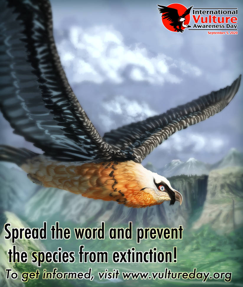
Vulture Awareness Day
I finished the last project on the 1st day of the month and right after, I wondered what to do next. And right when I flipped August into the past of my Calendar, I caught that it was only 5 days away from Vulture awareness day. I merely noticed its existence a few months prior and thoughtfully so made a notification in my calendar so I won’t forget it. The surprise was immediately followed by the realization that I’ll be doing this next.
Same day, I quickly sketched out the scene and sent an email to the official website, asking to use their logo for my poster and they happily obliged me with the permission, giving this a cool official impression :3 I’m also very happy how this turned out, given that it was finished in a mere 4 days, the only thing I’m not so happy with is the lettering. As I just couldn’t find a nice colour with a lot of contrast to the background… which didn’t look completely bland. I still think this was a very nice exercise to do and I will try to do something like this for every Vulture day from now on.
Mad Max Fury Road

This one was pretty rough. I didn’t think I’d have this finished when I was working on it. It took 5 days from start to finish and I had another 2 or 3 projects in the works simultaneously. This lack of ambition – I’m pretty sure – was caused by reserving to use tracing as a method of portraying the most important cars accurately to the movie. The moment that turned this around for me, though, was – I believe – when I applied the rendering. Suddenly the rough sketch came to live and I experimented some more with colour variation, overlay, dust effects and most importantly the radial blur filter, which I truly used its full potential of here. It was so much fun, I think I overused it a bit, I mean even the logo has been blurred that way xD
Of course another motivating factor was – again – the soundtrack, reigniting my love for that awesome movie. I even went out of my way and did a Black & Chrome edition, which wasn’t as simple as just decreasing the saturation of the original by the way… I had to adjust contrasts and tweak multiple layers to make sure things of same value don’t blend together.
Also the additional subtitle looks hella cool if I may say so myself…
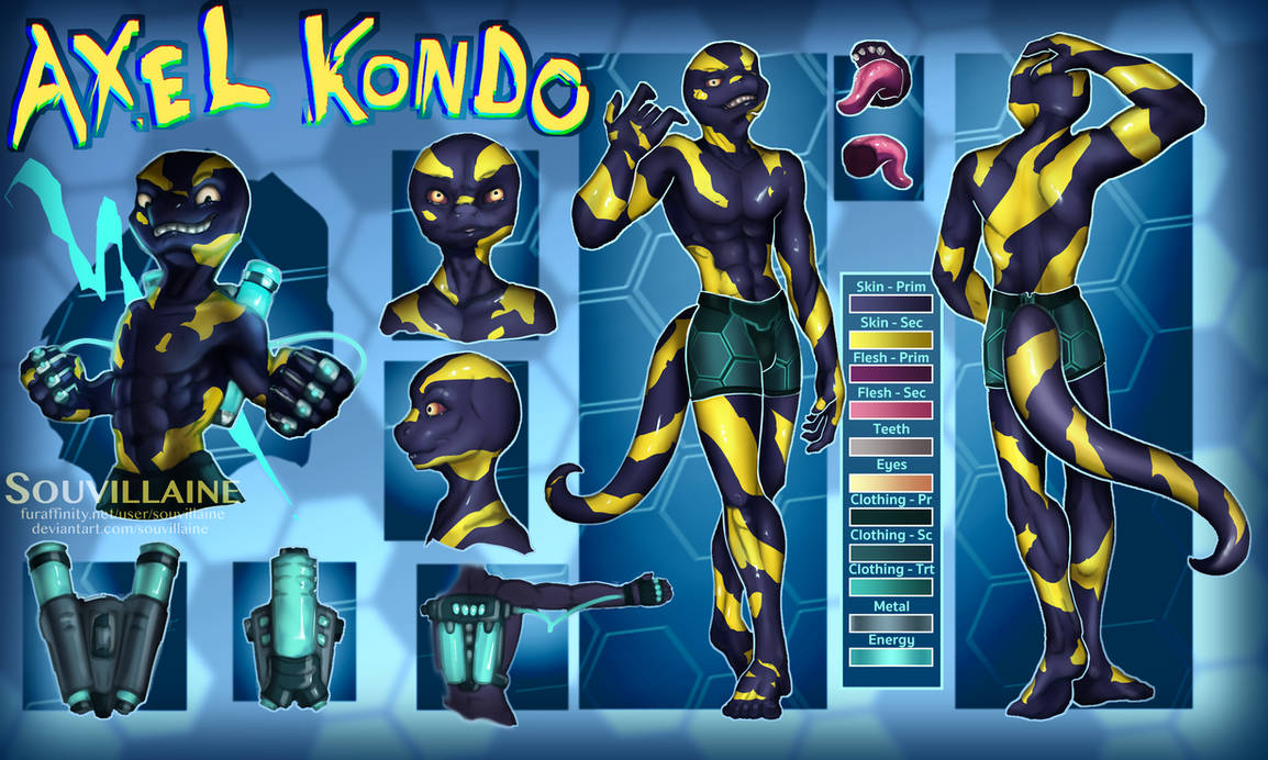
Axel Kondo – Reference Sheet

So, the projects all went much better and faster than I originally presumed, so I went ahead on a break by returning to my characters. The best fit for that was my salamander Axel, who finally should get his reference sheet after almost exactly 2 years since his first introduction.
This was very fun to start, the poses were pretty easy and didn’t need additional references, the only thing I find still meh is to add in the additional angles and objects. I am more of an illustrator than a designer but I can’t argue this will be helpful to others wanting t draw him.
Another note from between development: Deciding the overall colour scheme for this reference sheet was very difficult. I went with my usual rule-set of never extend the figure’s value- and saturation range and generally keep it very subtle and inconspicuous. What it looked like for a long while was just an ugly greyish gradient that caused me to almost give it up as nothing felt connected. And then an accident happened. Between managing my layers, I accidentally switched the layer mode my background layer and suddenly it all turned blue. And since then, it kinda worked out. I still had to tweak a lot afterward, but I finally felt good with it and I could better manage the lighting of the sheet. A good reminder to step out of your own rule-set a little every once in a while…
So all in all, a very eventful and quite positive month. The only region I neglected over the curse of this month was Animation. And while I’d love to do more, I am left completely out of projects. I can’t even share any ideas with you because I am very uncertain how to develop those.
I will have to make some more cleanup of the darn storyboard, and I have been working on a script for another (but a lot simpler) one but there hasn’t been progress in days, so I guess it’s on ice for now.
For October, I planned to have it mature -themed actually; in more ways than what you might be familiar here… The last thing I want to do is portraying tasteless themes, but I am very excited to step out of my usual comfort zone and be a little crazy for a change… I don’t expect you to like it but I still hope you can appreciate what I am going to do.
That’s all I can say for now. I wish you all a very spooky October this year!
